Visualizing tree-based models and why they work
Hello everyone! I struggled a lot last time to make sense how does a decision tree transform into a mathematical model so I thought I wrote this post for you to visualize better! The visualization comes along with an example. The contents for this post are:
1. How a decision tree transform into a graph
2. Varying depth of one tree [visualization]
3. Varying number of trees [visualization]
4. Varying learning rate
5. Do not try to maximize all hyperparameters!
6. Tree models tend to perform better than neural networks [or even deep learning models] for tabular data
When talking about tree models, people tend to have difficulty visualizing what do trees physically mean? How does a decision tree transform into a mathematical model? How is the cost function derived? And how do hyperparameters affect the cost function?
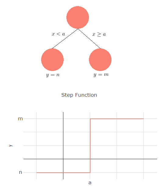
Many of you have probably seen a decision tree before. It is a flowchart structure, where we throw in observations (data points) and then an output comes out of the tree.
Mathematically, it’s a step function where
You can see the transition from tree to function on the right.
If you are not convinced why the second line is at y = 2.25, we can go back to secondary/high school calculus class. The question now is looking at only the blue data points above, where should we put the horizontal line such that the total distance is minimized. We have 6 data points at x = 2, 3 data points at x = 2.5 and 1 data point at x = 3.
Taking the mean squared error loss,
Varying depth of one tree
Now we have seen how the curve fits when we increase the depth of the tree. As we further increases the depth of the tree, this allows more flexibility as you can see
Varying number of trees
So far, we have only talked about predicting output with decision tree. How can we further improve our results? The question was first raised in the 80s: “Can a set of weak learners create a single strong learner?”. The weak learner in our case is the decision tree and the objective is to train multiple tree models and combine their information to a better mathematical model. We also call this ensemble learning.
Gradient boosting is a machine learning ensemble model which produces output from a combination of multiple decision trees. Unlike random forest, which uses a random subspace of data to form trees, gradient boosting trees uses the principle of gradient descent to form the trees in an additive manner. By adding the trees one by one, each new tree added aims to provide an output that reduces the cost function.
The tree does not necessarily need to be the best tree added. Gradient boosting is a greedy algorithm. The tree is added as long the cost function is reduced and the process continues. This is the general idea of gradient boosting. There are many variants of it and some of them are the best of the best (i.e. XGBoost/LightGBM). XGBoost for example, added a model complexity term (regularization) to control over fitting and uses a first order approximation to make calculations more efficient. The developers also stretches its computation limits by improving various parts of implementation which makes it amazingly fast.
For visualization purposes, we set all other hyperparameters to be the same (max depth = 1, learning rate = 0.1) and see for yourself how the model “learns” along the way!


Varying learning rate
The learning rate is an important hyperparameter when it comes down to fine tuning your model. It determines how fast your model can converge to a local minimum. If the learning rate is too high, it will “jump over” the local minimum and if the learning rate is too low, the model might take too long to converge.
How do we visualize learning rate for gradient boosting trees? learning_rate represents the step size of the step function (how high is your “staircase”) and in my notation, (m-n). Notice that if we set the learning rate to be too high, the algorithm will have difficulty dividing the data points.
I will be using GradientBoostingRegressor from scikit-learn.


So far, I have been using 2D models (one feature and one output) and of course, things doesn’t work that way in real life.
The idea is roughly the same but the manifold can also transform across different dimensions (x-y and y-z for 3 dimentions) since features interact with each other.
Do not try to maximize all hyperparameters!
It is easy to fall into this fallacy that the larger the hyperparameters are, the better (or for learning rate, the smaller the better). The purpose of this analysis is not to show you bigger is better but to show you how and why models transform as we vary these hyperparameters.
Max Depth
This is a dangerous hyperparameter to set too high as a tree too large (with too many roots) will over fit the data and validation data will suffer terribly. But at the same time, as you see above, a small tree might not capture enough information on your data. You may set it to a larger number (by large, probably 10), prune the tree and see if the validation cost function is reduced.
Learning Rate
If you have all the time in the world, setting it low would be ideal but it would need a higher number of trees to converge to a sufficiently low local minima. This is a hyperparameter that requires experimentation so play around with the numbers! You can also use GridSearchCV (a function in sklearn) to find the optimal learning rate for your data
Number of Trees
As we add more trees, it seems like the cost function will always reduce. However, it is important to note that this does not necessarily mean the validation (unseen data) cost function. It is very common for the validation cost function to increase and the training cost function to decrease. That is the point where you know your model is over fitting. While there is no “magic number”, it is important to add early_stopping_rounds in your pipeline. You set early_stopping_rounds to an arbitrary number (maybe 30). If the validation cost function fail to decrease for 30 rounds, the model will stop running.
Based from my experience, it depends a lot on the nature of the data. There is no fixed number or formula, which makes fine tuning hard and more like an art. That is why we need to experiment on the models. There is however a general guideline which you can use to set up a baseline model. learning rate is typically 0.01-0.2, max depth is usually 5 to 8, while the number of trees can be from 50 to 1000. Of course, there are other hyperparameters to fine tune, talk to me if you like to see how other hyperparameters transform the model!
Tree models tend to perform better than neural networks [or even deep learning models] for tabular data
There are plenty of models out there you may have heard of: neural networks, SVMs, logistic regression etc
While neural networks and deep learning have been the buzzwords people like to use in social settings, tree-based variants like XGBoost and LightGBM have actually been outperforming every other algorithm when handling tabular data (that is, structured data or non-image/audio/text data). Verify yourself by looking into online data science competitions (i.e. Kaggle) and you will be almost surprised that the top entries all use the same algorithm.
There are a number of reasons why I think they do.
The main reason why deep learning works is because of the architecture of the models. And that is the very same reason why you should not apply them to tabular data blindly. If we are talking about non-structured data (image/audio/text data), it is actually more intuitive to use particular hierarchical models.
For text data, it is sequential and we therefore require a model where the nodes can “adjust back and forth” or in a “cyclic manner“.
For image data, individual pixels do not mean anything but they have a higher correlation with neighboring pixels as compared to pixels further away. They therefore require a model that can force and transform the interaction (convolution) of the pixels. In that sense, we can then “capture” information like edges and shapes.
It’s hard to make sense how “moving forward and backward” or “capturing edges” can help for tabular data. When talking about features like gender or colour, they are already very explicit and deep structures only serve to complicate the models. This makes them hard to converge to a lower cost function value.
On the other hand, tree-based models incorporate tabular data very naturally. They allow features to complete against and with each other internally. Take for instance, you want to create a churn model to predict if a person will continue his/her Spotify subscription after a month of free membership.
Assume we know two features 1) his/her music preferences and 2) the frequency of him/her using the service. Certainly, if he has been using it to listen to music often, it is more likely for him to continue his subscription and having that feature will help to improve your model better.
Suppose we also know the gender and based on historical data, we know that a specific gender have a higher probability of continuing the service. Certainly, having the information of both features will help us predict the model better.
Now, I’m not implying that other algorithms are worthless. Fine tuning can make a lot of difference in your results. Also, having some diversity in your results might help when ensembling your final model as well.
It is common practice to combine multiple XGBoost models and neural networks to achieve a better metric result.